How to Create a Search View in Jetpack Compose: A Step-by-Step Guide
Learn How to Create a Custom Search View in Jetpack Compose
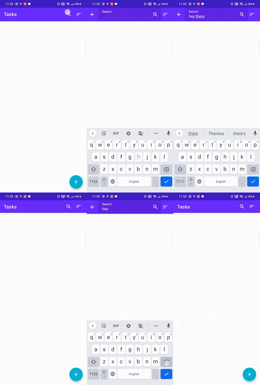
I recently came across a challenge when I was making an app completely using Jetpack Compose, if you haven't heard about it check it out. I needed a Search View, but there was no out-of-the-box solution for it so I created my own. Here's is how it looked like:

To create a search view in Jetpack Compose, we need to define three functions: ExpandableSearchView, CollapsedSearchView, and ExpandedSearchView. The ExpandableSearchView function will contain the logic for expanding and collapsing the search view, while the CollapsedSearchView and ExpandedSearchView functions will define the appearance and behavior of the search view when it is collapsed and expanded, respectively.
First, let's define the ExpandableSearchView function. It should take the following arguments:
searchDisplay: This is the string that is displayed in the search field when it is collapsed.onSearchDisplayChanged: This is a lambda function that is called when the search display is changed. You can use this function to update the UI or perform a search based on the new search display.onSearchDisplayClosed: This is a lambda function that is called when the search display is closed. You can use this function to reset the search display or clear the search results.modifier: This is an optional argument that allows you to specify aModifierfor the search view.expandedInitially: This is an optional argument that specifies whether the search view should be expanded initially. The default value isfalse.tint: This is an optional argument that specifies the color of the search icon and the text in the search field. The default value is theonPrimarycolor from theMaterialTheme.
Here's the code for the ExpandableSearchView function:
@Composable
fun ExpandableSearchView(
    searchDisplay: String,
    onSearchDisplayChanged: (String) -> Unit,
    onSearchDisplayClosed: () -> Unit,
    modifier: Modifier = Modifier,
    expandedInitially: Boolean = false,
    tint: Color = MaterialTheme.colors.onPrimary
) {
    val (expanded, onExpandedChanged) = remember {
        mutableStateOf(expandedInitially)
    }


    Crossfade(targetState = expanded) { isSearchFieldVisible ->
        when (isSearchFieldVisible) {
            true -> ExpandedSearchView(
                searchDisplay = searchDisplay,
                onSearchDisplayChanged = onSearchDisplayChanged,
                onSearchDisplayClosed = onSearchDisplayClosed,
                onExpandedChanged = onExpandedChanged,
                modifier = modifier,
                tint = tint
            )

            false -> CollapsedSearchView(
                onExpandedChanged = onExpandedChanged,
                modifier = modifier,
                tint = tint
            )
        }
    }
}
The ExpandableSearchView function uses a Crossfade component to switch between the collapsed and expanded states of the search view. When the search view is collapsed, it displays the CollapsedSearchView component. When the search view is expanded, it displays the ExpandedSearchView component.
Next, we need to define the CollapsedSearchView and ExpandedSearchView components.
The CollapsedSearchView component is a simple row that displays a text label and a search icon button. When the search icon button is clicked, the CollapsedSearchView component calls the onExpandedChanged lambda function to expand the search view.
Here is the code for the CollapsedSearchView component:
@Composable
fun CollapsedSearchView(
    onExpandedChanged: (Boolean) -> Unit,
    modifier: Modifier = Modifier,
    tint: Color = MaterialTheme.colors.onPrimary,
) {

    Row(
        modifier = modifier
            .fillMaxWidth()
            .padding(vertical = 2.dp),
        horizontalArrangement = Arrangement.SpaceBetween,
        verticalAlignment = Alignment.CenterVertically
    ) {
        Text(
            text = "Tasks",
            style = MaterialTheme.typography.h6,
            modifier = Modifier
                .padding(start = 16.dp)
        )
        IconButton(onClick = { onExpandedChanged(true) }) {
            SearchIcon(iconTint = tint)
        }
    }
}
The ExpandedSearchView component is a row that contains a back icon button and a text field for entering the search query. The text field is bound to the searchDisplay variable, so any changes to the search query will be reflected in the searchDisplay variable and the onSearchDisplayChanged lambda function will be called. When the user clicks the back icon button or hits the "done" button on the keyboard, the ExpandedSearchView component calls the onSearchDisplayClosed lambda function and collapses the search view.
Here is the code for the ExpandedSearchView component:
@Composable
fun ExpandedSearchView(
    searchDisplay: String,
    onSearchDisplayChanged: (String) -> Unit,
    onSearchDisplayClosed: () -> Unit,
    onExpandedChanged: (Boolean) -> Unit,
    modifier: Modifier = Modifier,
    tint: Color = MaterialTheme.colors.onPrimary,
) {
    val focusManager = LocalFocusManager.current

    val textFieldFocusRequester = remember { FocusRequester() }

    SideEffect {
        textFieldFocusRequester.requestFocus()
    }

    var textFieldValue by remember {
        mutableStateOf(TextFieldValue(searchDisplay, TextRange(searchDisplay.length)))
    }

    Row(
        modifier = modifier.fillMaxWidth(),
        horizontalArrangement = Arrangement.Start,
        verticalAlignment = Alignment.CenterVertically
    ) {
        IconButton(onClick = {
            onExpandedChanged(false)
            onSearchDisplayClosed()
        }) {
            Icon(
                painter = painterResource(id = R.drawable.ic_back),
                contentDescription = "back icon",
                tint = tint
            )
        }
        TextField(
            value = textFieldValue,
            onValueChange = {
                textFieldValue = it
                onSearchDisplayChanged(it.text)
            },
            trailingIcon = {
                SearchIcon(iconTint = tint)
            },
            modifier = Modifier
                .fillMaxWidth()
                .focusRequester(textFieldFocusRequester),
            label = {
                Text(text = "Search", color = tint)
            },
            keyboardOptions = KeyboardOptions(
                imeAction = ImeAction.Done
            ),
            keyboardActions = KeyboardActions(
                onDone = {
                    focusManager.clearFocus()
                }
            )
        )
    }
}
Finally, we need to define a SearchIcon function that creates an icon for the search view. This function takes a iconTint argument to specify the color of the icon.
@Composable
fun SearchIcon(iconTint: Color) {
    Icon(
        painter = painterResource(id = R.drawable.ic_search),
        contentDescription = "search icon",
        tint = iconTint
    )
}
With these functions defined, we can now use the ExpandableSearchView to create an expandable search view in Jetpack Compose. To do this, simply call the ExpandableSearchView function and pass the necessary arguments.
That's it! You should now have a working expandable search view in Jetpack Compose. You can customize the appearance and behavior of the search view by modifying the ExpandableSearchView, CollapsedSearchView, and ExpandedSearchView functions as needed.
I hope this tutorial has helped you understand how to create an expandable search view in Jetpack Compose. If you have any questions or comments, feel free to leave them below.
